 We live in a world of screens – you don’t have to look very far to see this for yourself. The average train, bus, airplane, or coffee shop is full of people who are busy with their phones, their tablets, and their laptops. It’s interesting, however, that the world of paper has not gone away at all. When e-books started to become popular, a lot of people thought that paper books would go extinct – they didn’t. When digital marketing became hugely important, it was widely assumed that direct mail marketing would be a thing of the past – it isn’t. Businesses large and small still make use of direct mail in order to reach existing and potential customers. In large part, this is actually because the digital channels have become so crowded.
In short, both paper and screens are relevant today in everything from business to creative work – but there’s something about this fact that has a lot of people stumped. Why is it that things look different on paper than they do on a computer screen. For example, if you’re printing a color document from your laptop, and you hold up the printed sheet to your computer screen, shouldn’t it look exactly the same?
Well, not exactly – and there are good reasons for this.
The main reason, of course, is a difference in lighting. Digital screens have a back light, whereas printed sheets reflect light. This naturally leads to a difference in the appearance of colors. The difference in resolution between different screens will also have an effect on how colors look digitally. Likewise, the quality of the printer and ink will go a long way in determining how closely the printed page will match what was created on screen.
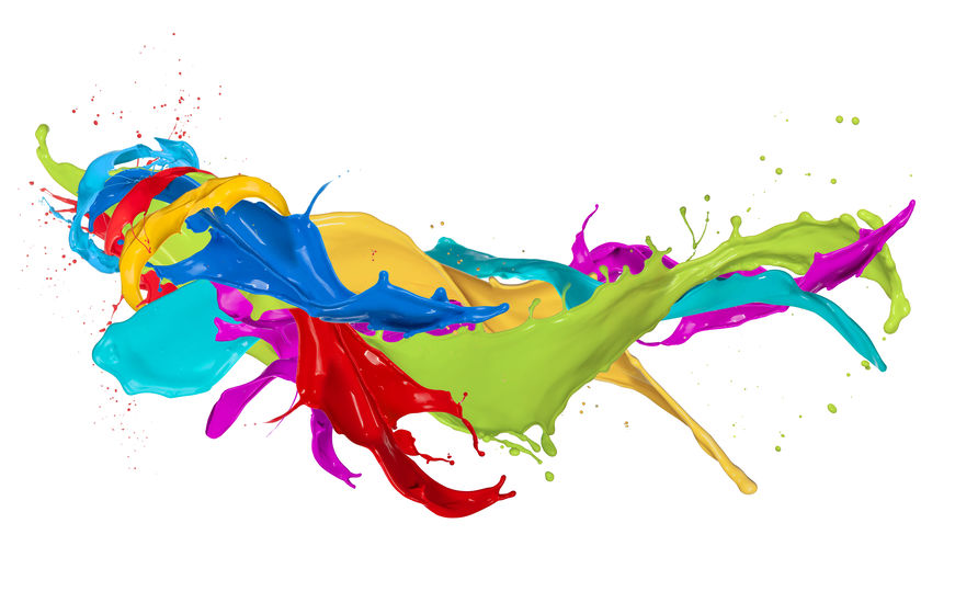
There is also the fact that different color schemes exist – namely RGB (Red, Green, Blue) and CMYK (Cyan, Magenta, Yellow, Black). These describe the base colors that are mixed together in different ways to achieve the colors you want.
Aside from a difference in base colors, RGB is known as an “additive” color scheme, in that it “adds” different combinations of the three main colors in order to produce the desired color. By contrast, CMYK is known as a “subtractive” color scheme in that it actually produces the desired colors by “subtracting” various CMYK values.
It’s worth noting, however, that in many cases the differences in color go unnoticed by people. Today’s professional print services can do a very good job in matching colors to the greatest extent possible, and for the most people, the subtle differences between digital images and printed images go unnoticed.
Of course, this is assuming that the pages have been printed by a professional, or by a high-quality home printer. Professionals obviously have more experience and knowledge about the various color schemes and how to effectively translate colors from the digital to the printed world. In some cases, the difference in color really can make a negative difference if not handled correctly. This is yet another argument to work with true professionals for your printing projects.