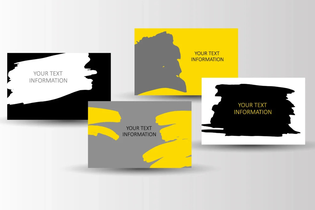
Companies or organizations that want to leave a lasting impact should invest in professional and well-customized business cards.
It is crucial to combine originality with professionalism since a well-customized card is a representation of a company’s identity and a potent marketing tool.
When printing business cards, the design should be visually appealing and readable, from selecting ideal colors to choosing fonts that capture the eye.
Incorporating local elements or trends can give New Jersey professionals a unique edge, ensuring their cards resonate with the audience and help forge meaningful connections in a competitive market.
Size and Layout
Making unique business card designs for professionals in New Jersey requires careful consideration of layout and size selection. A card that is 3.5 x 2 inches in size is usually well proportioned to fit in wallets or cards and be easy to carry. Important facts like the recipient’s name, contact information, and branding are highlighted in a clear, well-balanced arrangement that does not overwhelm them. The card becomes more professional and memorable in networking situations when white space, typefaces, and graphics are strategically used.
Readable Text
In order to make it easier for prospective partners or clients to get in touch, contact information should be shown in a clear, readable typeface. In addition to making the card seem less cluttered, readable writing boosts professionalism by highlighting important information. A professionally made card with legible content may leave a lasting impression in the competitive corporate world of New Jersey, improving networking opportunities and building solid professional relationships.
Incorporate Color Thoughtfully
Employing color strategically helps professionals communicate their unique personalities and enhances brand recognition. Bright colors might draw attention, while muted colors exude sophistication and knowledge. Choosing colors that go well with your target audience and sector can help ensure that the message on your business card is well understood. A well-thought-out color scheme will help make sure that your card stands out by making it easier to read and highlighting important details.
Utilize the White Space
Also known as negative space, white space adds to an organized, clean appearance and highlights crucial elements like company branding, contact details, and logos. By creating a visual hierarchy and balance, important aspects can be highlighted without overpowering the observer. Effective use of white space on a business card conveys professionalism, clarity, and refinement to busy professionals, leaving a lasting impression on prospective partners and clients.
High-Quality Materials
Premium cards have an elegant and refined appearance that makes it stand out due to unique materials like thick cardboard, textured paper, or finishes like gloss or matte. When distributed, these materials leave a lasting impact and enhance the tactile experience. Furthermore, superior materials guarantee that the designs, typography, and colors seem crisp and vivid, accurately conveying the business owner’s professionalism and brand identity.
Reflect Local Identity and Values
Including elements connected to the sector, notable sites, or regional culture can help make the card more memorable and timelier. It could also be interesting for experts in the field to highlight traits that are fundamental to New Jersey’s identity, such as adaptability, diversity, and creativity. This technique makes the business card a more effective networking tool by strengthening trust and engagement in addition to increasing visual appeal.
Highlight Key Information
Carefully adding essential contact information about the business makes it easy for potential clients to contact you. This not only simplifies the follow-up procedure but also indicates a dedication to accessibility and professionalism. Additionally, using a consistent and legible font style for your contact details improves reading and eliminates misunderstanding. In a competitive market like New Jersey, a well-designed business card with visible contact information might be the difference between a quick meeting and a lucrative new relationship.
Printing on Both Sides
The two sides of the card allow you to display more information, which enhances the visual appeal and perception of your business. Your most crucial contact details may be highlighted on the front, and a mini-portfolio, a QR code connecting to your website, or an engaging call to action could be on the back. This intelligent use of space not only broadens your design options but also exhibits the attention to detail and expertise that distinguishes you in the competitive New Jersey market.
Creating visually striking business cards is a crucial part of corporate branding. One can create a good impression on business partners and prospective customers by including components like premium materials, a clear and simple design, and an unforgettable logo. Remember that a well-made business card is more than simply a piece of paper but a representation of your company’s identity and an important instrument for networking and relationship building.


