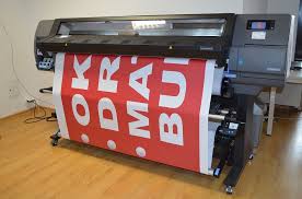
 Even with the rise of cheap DIY printers and easily accessible print-on-demand stations, professional printing services remain strong and relevant in today’s business world. There are just some projects that are either too large or too important to be entrusted to home and retail printing stations. These are the projects where you need a professional at the helm, who oversees your production process, helps you get the message and artwork right, and delivers eye-catching stacks of copies for your meeting, mailing or event.
Whether you turn to the pros or do it yourself, there are a few common mistakes that can make things a lot more difficult than they have to be? Here are 5 costly printing errors and how to avoid them.
1. Getting the bleed wrong
People often don’t realize that even professional printing machines do not print perfectly all the way to the edge of the paper. That’s why “bleed” is used. This refers to making the borders of the document than the desired size. Depending on the project and the printing surface, bleed requirements can vary significantly in size. The pages are then trimmed mechanically, resulting in perfect printing to the edge of the page. When the bleed is missing or miscalculated, things can get frustrating and expensive in a hurry. If you’re submitting files in a popular format to your printing specialist, they will be able to guide you in terms of the required bleed.
2. Bad resolution
Believe it or not, it’s hard for some people to grasp that how it looks on the computer screen is not how it will look on a printed page. On a screen, an image of 72 dpi looks fairly clear. On paper, that same image would look notably grainy or blurry. A standard dpi for clear images on paper is 300 dpi. For large lettering, a process called vector can be used to keep text absolutely sharp, no matter how large or small the document. There are all kinds of ways in which resolution can be overlooked, but if a professional makes this kind of mistake, it will cost you time.
3. Unreadable text
Some printed designs are simply not easy to look at or read. The text is too small or too close together. The visual elements of the page are chaotic and confusing. It’s much better to have an eye-catching design that conveys your message clearly, whatever it may be. A lot of projects that technically perfect in terms of printing, are actually low quality because of the design itself. Again, good printing companies are able to guide their clients in this respect.
Talk to a professional for more info
Reputable print houses are happy to have a brief discussion about your project, and are always timely about getting back to you. These “service” elements of professional printing are just as important as the technical ones, and there’s no reason why the contractor you hire should not have both. Good luck on all of your professional printing projects!

